Gabriela Perez is a designer specializing in illustration and animation.
This is a short case study and collection of assets from my personal branding. You can see elements of it sprinkled throughout my website and across my social media accounts. Since 2024 I have been committed to strengthening my animation muscles, and honing my illustration skills. With all that growth, I wanted my branding to reflect that. While I leaned on my animation and illustration skills to craft this brand, I wanted to of course use my design expertise to tie everything together and create comprehensive brand guidelines that would give insight into my process.
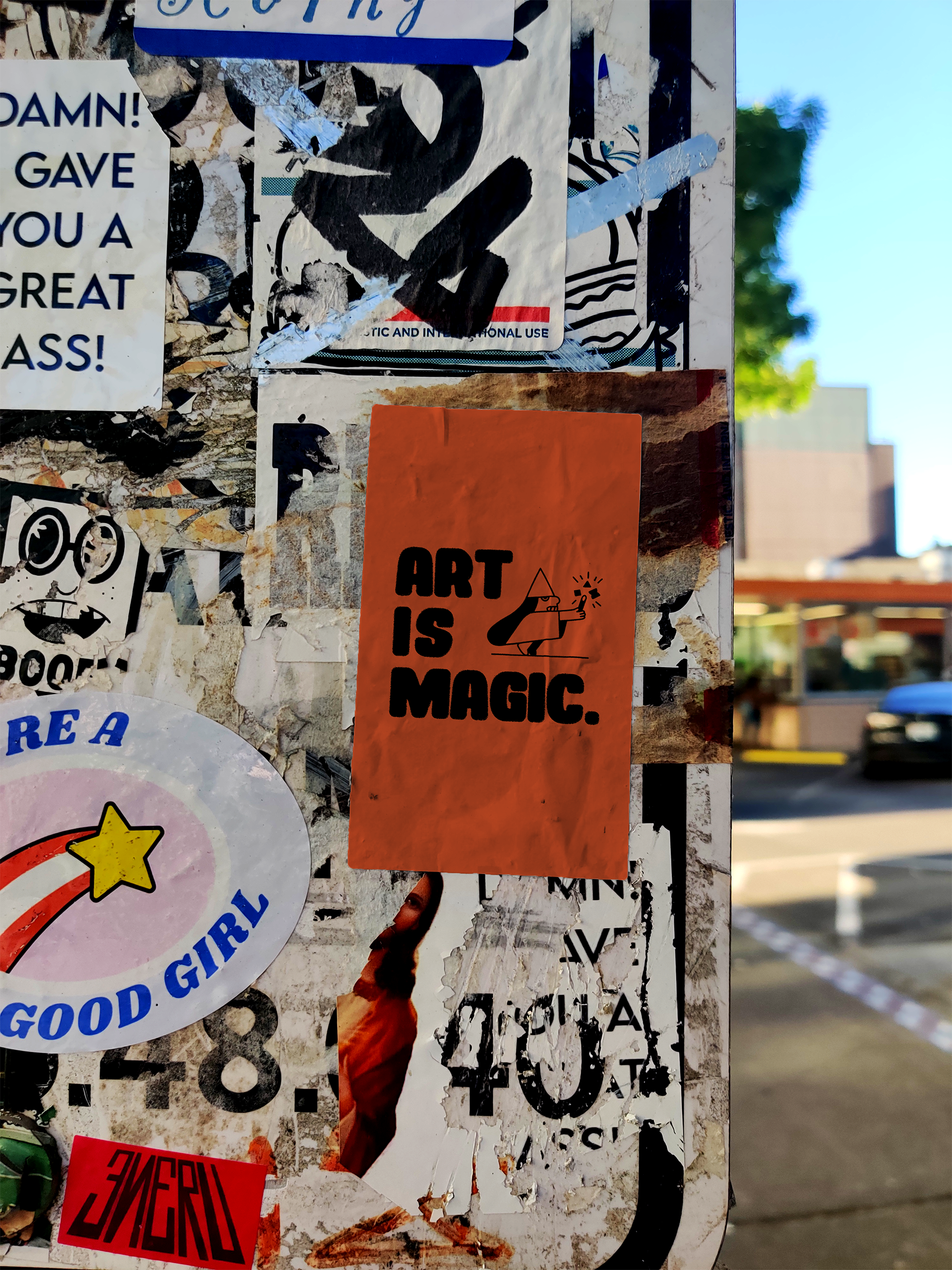
Overall this branding relies on an elaborate illustration system, bold colors and inky textures to tie together several of my strengths as an artist. My goals were to create a comprehensive illustration system that was flexible for a variety of use cases while feeling relevant to my work for years to come. With those goals in mind, I stayed true to my style with thick line work, unique characters and comedic themes.
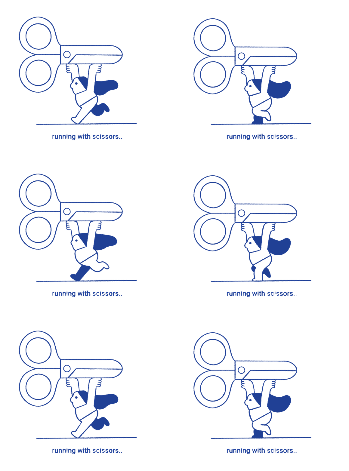
A lot of heart went into this branding project and it’s been a on the back burner for a couple years now. This animation below has been a guiding star for this project. The original animation was done frame by frame in Procreate in 2022 and I originally just wanted to remake it using After Effects and more advanced animation techniques at the start of 2024. The project quickly grew in scale as I started chipping away at this idea, building up whole illustration system and a refreshed look all from this first draft.
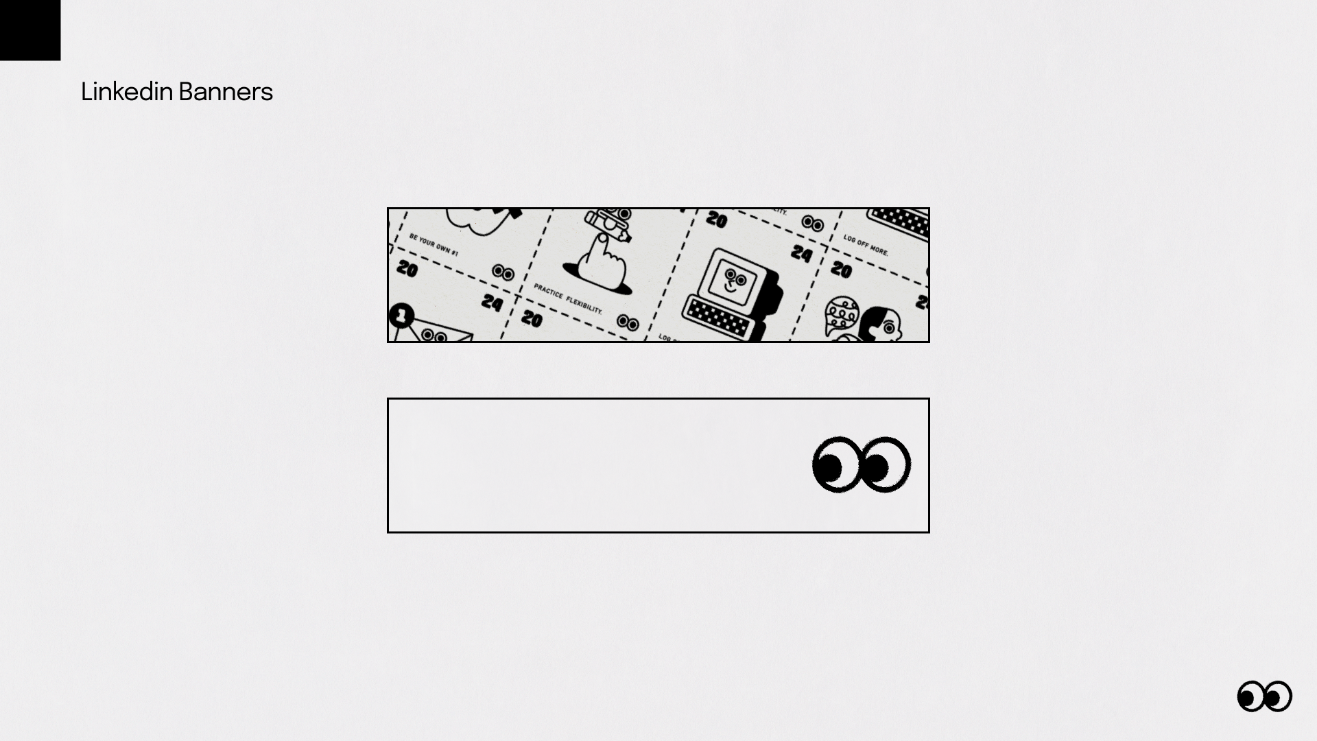
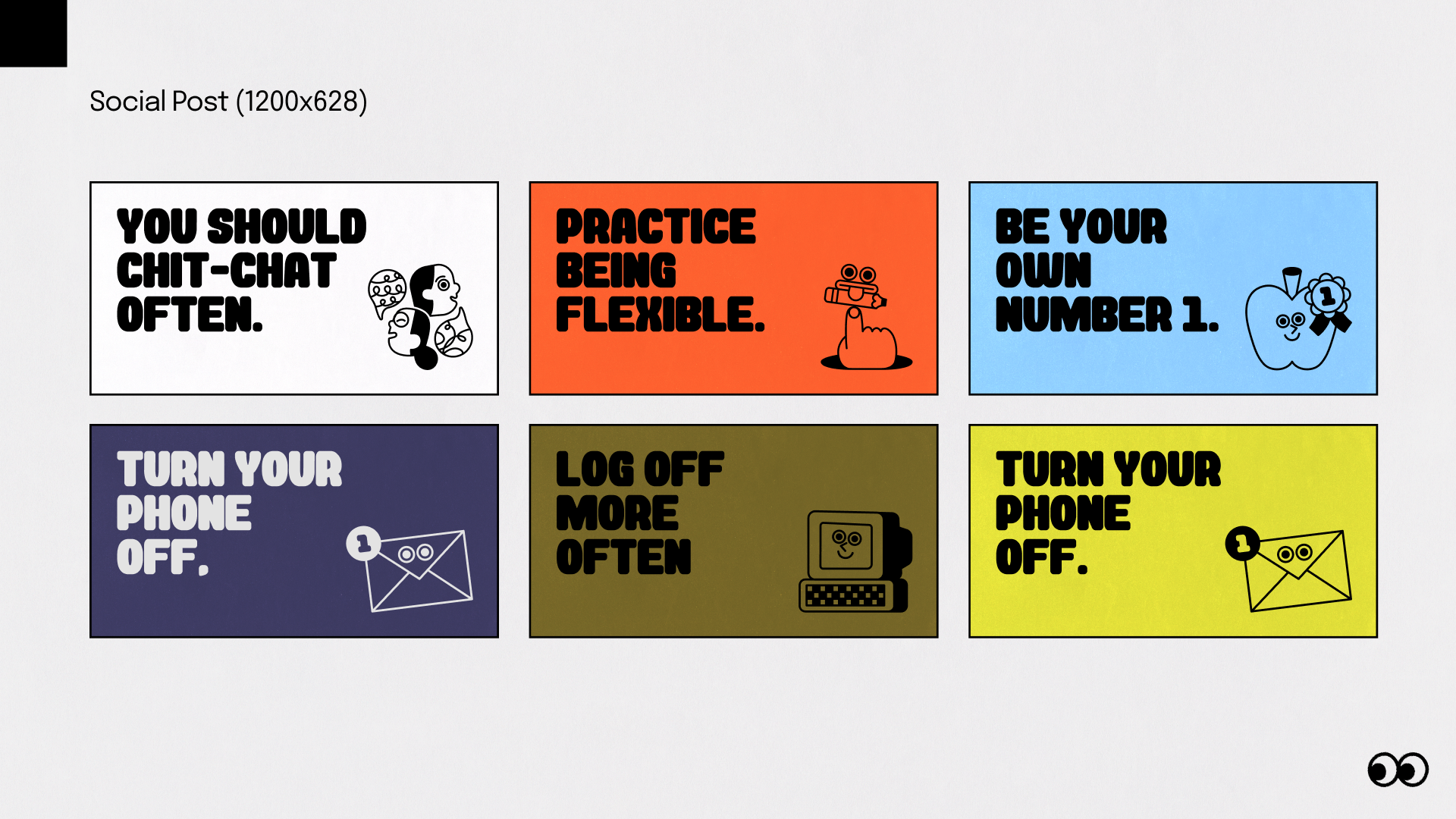
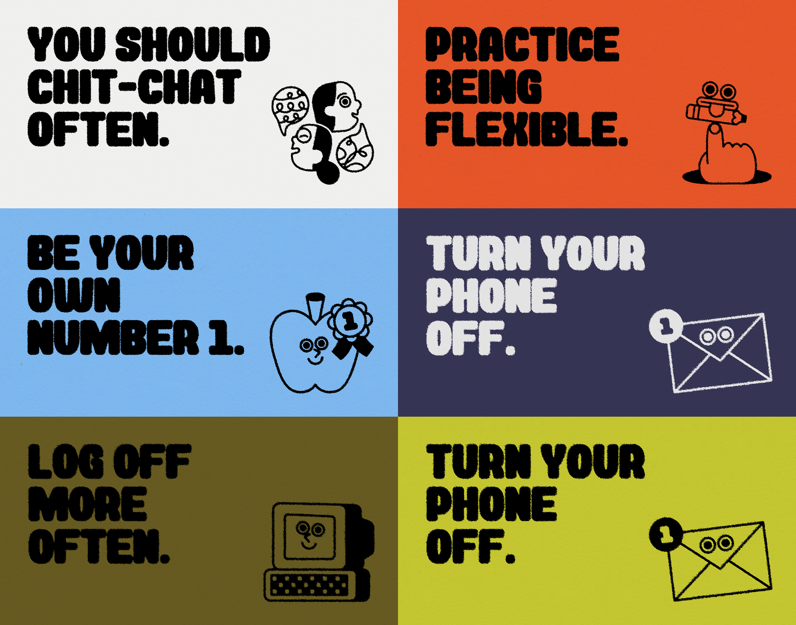
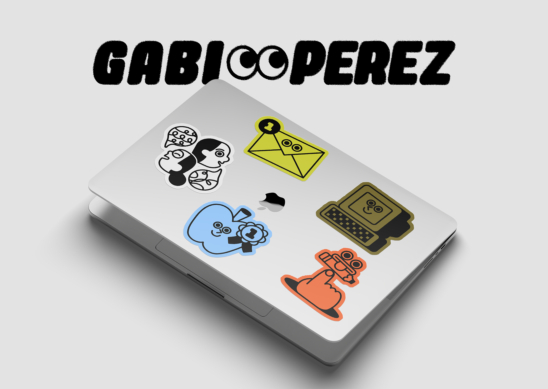
The biggest inspiration for this collection of illustration and animations was from editorial illustrations you find in the news paper, printed in black and white. I wanted this illustration style to be simple but meaningful. Above you can see this first batch of illustrations, each with it’s own copy and context. The primary use case for these illustrations is pitch decks and social media. So while they have meaning relevant to the decks I send to clients, they’re also visually interesting and perfect for social media use. Below you can see some of those use cases.
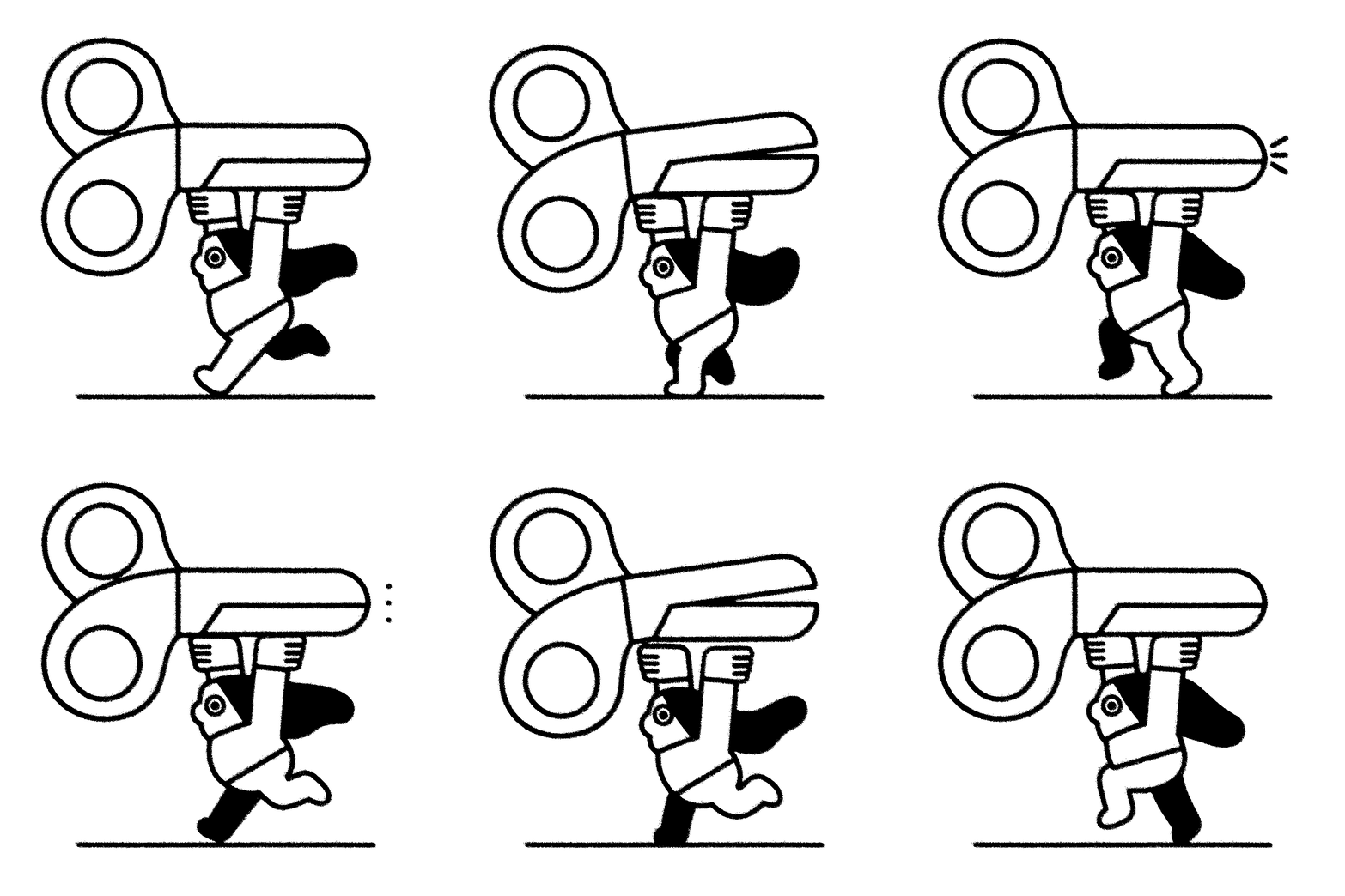
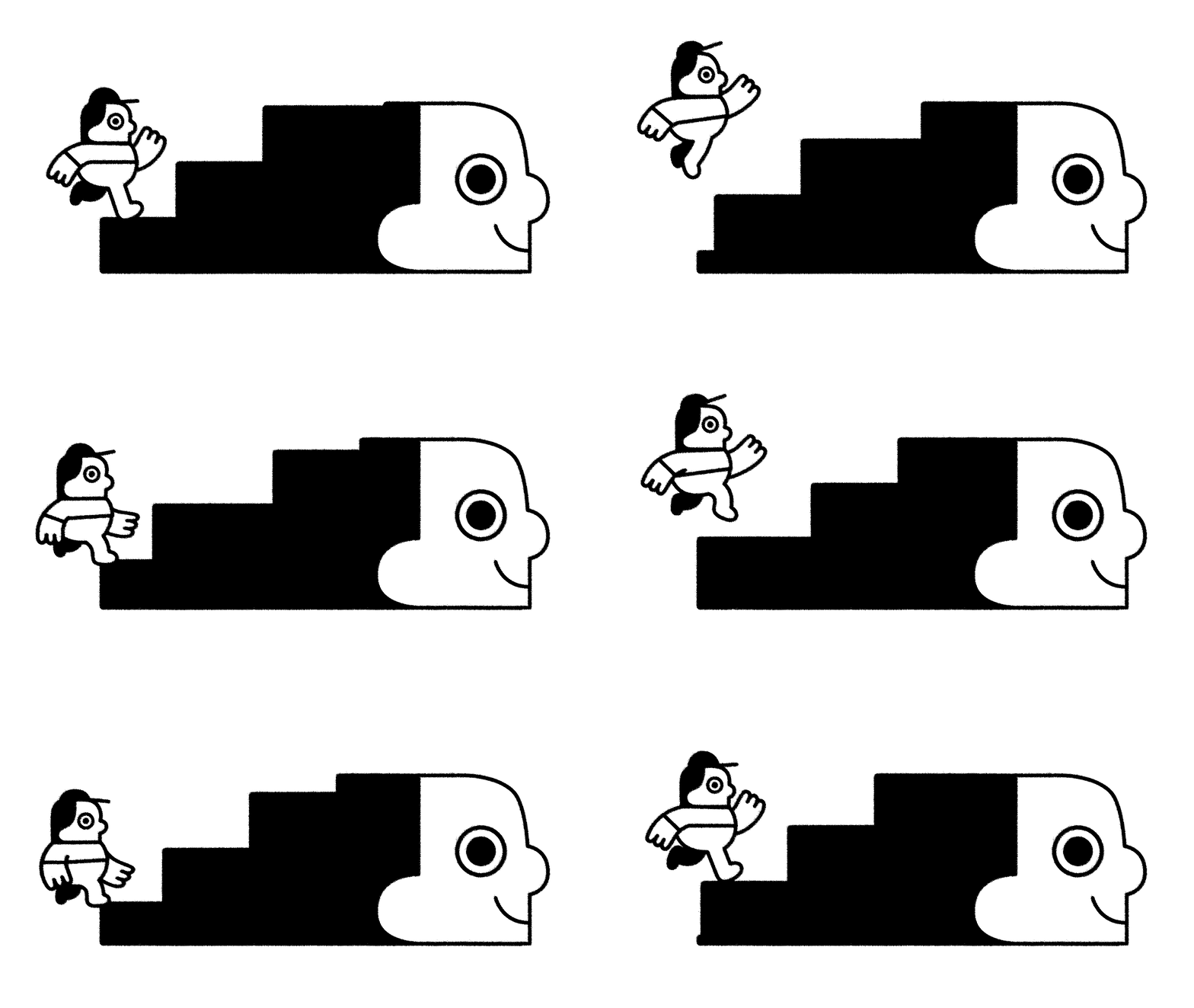
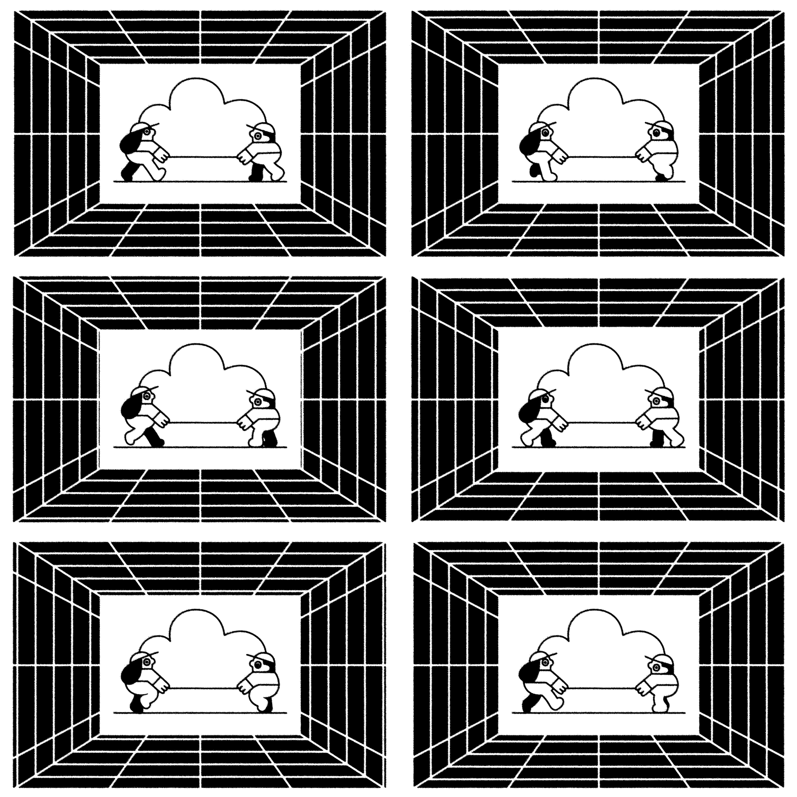

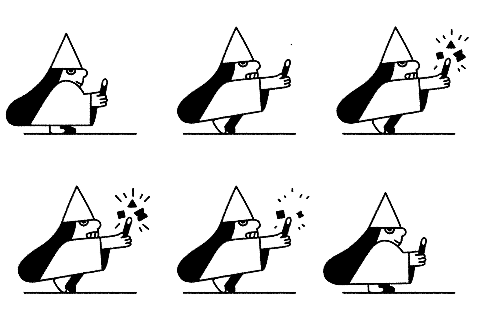
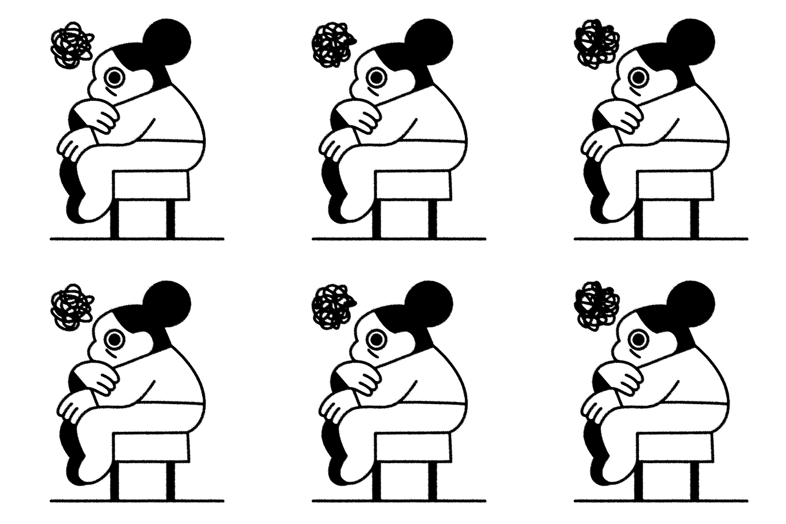
This first batch of animations was primarily created with my website in mind. You can see them throughout my site. While they are intended to be story driven yet their simple execution keeps them from distracting users as they navigate my website while still providing pops of whimsy.
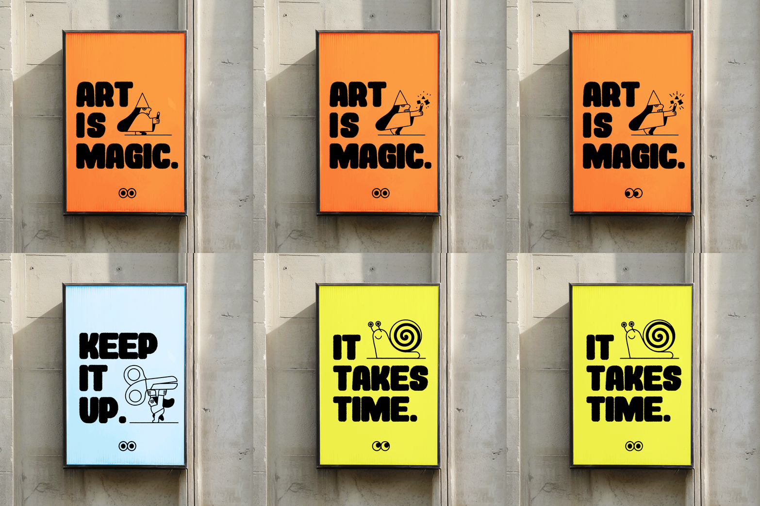
Below is the full branding guidelines I created to have as a reference for myself and as fun design practice. I kept everything simple since I needed this to be a flexible design system. Between the colors and illustrations this branding stands out and is true to my style. I hope to continue adding to the illustration library and modifying the branding guidelines as my needs change. You can check out the Figma asset library and branding guides if you’re interested in seeing animated content within the guidelines.


